Eye #106
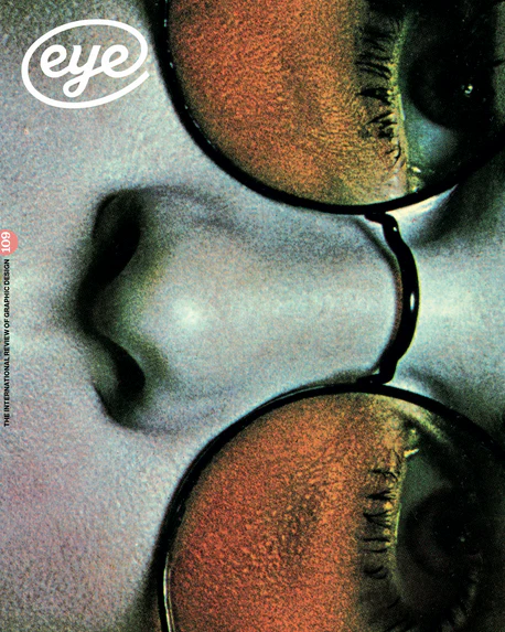
Eye is the world’s most beautiful and collectable graphic design journal, published for professional designers, students and anyone interested in critical, informed writing about graphic design and visual culture.
This is what Eye editor John L. Walters says about this issue;
'It is in the nature of an Eye type special issue to be full of the shapes of letterforms and images of letters. The body type in these articles is set in Sharp Serif by Lucas Sharp. In our Reputations interview with Sharp and his partner Chantra Malee, he muses that typeface design is essentially about form, with contours and ‘the separation of space’, while graphic design is more ‘curatorial’.
One advance of recent decades is the multiplicity of scripts and languages made accessible through new technology. Ferdinand Ulrich’s ‘Harmony and counterpoint’ examines the complex and nuanced issues surrounding the creation of designs in which two or more different scripts are obliged to coexist.
London’s Type Archive was once a place where you could see not only the artefacts of type production, but the machines that made them, a reminder of the extensive manufacturing and engineering that went into creating metal type. Now, most of its contents have been catalogued, barcoded and put into storage. Some of the Archive’s oral history has been recorded in films for the Science Museum; and our article features Philip Sayer’s documentary photography from its final months. Happily, Paul Shaw has some good news: digital advances have made this era a ‘golden age’ for type history.
‘Phil Baines Remembered’ pays tribute to a designer whose practice and teaching brought together many elements: experimentation, tradition and the digital revolution. Luca Pitoni throws new light on the formal beauty and systematic thinking that Anita Klinz (1923-2013) applied to the design of books and book series throughout a long career in Italian publishing. And we unveil a new, regular feature: type reviews.
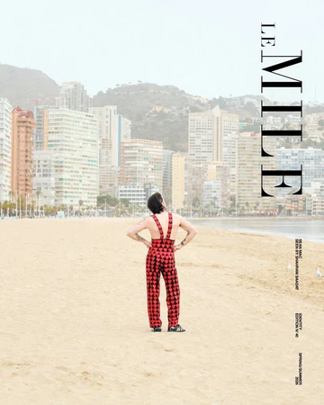
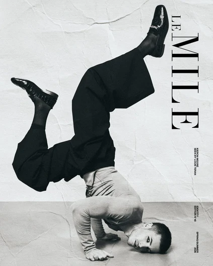
Please note that magazine covers cannot be specified at the time of the order. However, you can indicate your preferred cover in the order notes at checkout.
If the cover you prefer is available, we will do our best to send it. If the cover you specify is the only one you are willing to accept, please indicate this clearly in your order notes. Otherwise, we will consider it as a preference and will send a cover based on availability.
Eye is the world’s most beautiful and collectable graphic design journal, published for professional designers, students and anyone interested in critical, informed writing about graphic design and visual culture.
This is what Eye editor John L. Walters says about this issue;
'It is in the nature of an Eye type special issue to be full of the shapes of letterforms and images of letters. The body type in these articles is set in Sharp Serif by Lucas Sharp. In our Reputations interview with Sharp and his partner Chantra Malee, he muses that typeface design is essentially about form, with contours and ‘the separation of space’, while graphic design is more ‘curatorial’.
One advance of recent decades is the multiplicity of scripts and languages made accessible through new technology. Ferdinand Ulrich’s ‘Harmony and counterpoint’ examines the complex and nuanced issues surrounding the creation of designs in which two or more different scripts are obliged to coexist.
London’s Type Archive was once a place where you could see not only the artefacts of type production, but the machines that made them, a reminder of the extensive manufacturing and engineering that went into creating metal type. Now, most of its contents have been catalogued, barcoded and put into storage. Some of the Archive’s oral history has been recorded in films for the Science Museum; and our article features Philip Sayer’s documentary photography from its final months. Happily, Paul Shaw has some good news: digital advances have made this era a ‘golden age’ for type history.
‘Phil Baines Remembered’ pays tribute to a designer whose practice and teaching brought together many elements: experimentation, tradition and the digital revolution. Luca Pitoni throws new light on the formal beauty and systematic thinking that Anita Klinz (1923-2013) applied to the design of books and book series throughout a long career in Italian publishing. And we unveil a new, regular feature: type reviews.
Please note that magazine covers cannot be specified at the time of the order. However, you can indicate your preferred cover in the order notes at checkout.
If the cover you prefer is available, we will do our best to send it. If the cover you specify is the only one you are willing to accept, please indicate this clearly in your order notes. Otherwise, we will consider it as a preference and will send a cover based on availability.
Original: $26.81
-65%$26.81
$9.38Description
Eye is the world’s most beautiful and collectable graphic design journal, published for professional designers, students and anyone interested in critical, informed writing about graphic design and visual culture.
This is what Eye editor John L. Walters says about this issue;
'It is in the nature of an Eye type special issue to be full of the shapes of letterforms and images of letters. The body type in these articles is set in Sharp Serif by Lucas Sharp. In our Reputations interview with Sharp and his partner Chantra Malee, he muses that typeface design is essentially about form, with contours and ‘the separation of space’, while graphic design is more ‘curatorial’.
One advance of recent decades is the multiplicity of scripts and languages made accessible through new technology. Ferdinand Ulrich’s ‘Harmony and counterpoint’ examines the complex and nuanced issues surrounding the creation of designs in which two or more different scripts are obliged to coexist.
London’s Type Archive was once a place where you could see not only the artefacts of type production, but the machines that made them, a reminder of the extensive manufacturing and engineering that went into creating metal type. Now, most of its contents have been catalogued, barcoded and put into storage. Some of the Archive’s oral history has been recorded in films for the Science Museum; and our article features Philip Sayer’s documentary photography from its final months. Happily, Paul Shaw has some good news: digital advances have made this era a ‘golden age’ for type history.
‘Phil Baines Remembered’ pays tribute to a designer whose practice and teaching brought together many elements: experimentation, tradition and the digital revolution. Luca Pitoni throws new light on the formal beauty and systematic thinking that Anita Klinz (1923-2013) applied to the design of books and book series throughout a long career in Italian publishing. And we unveil a new, regular feature: type reviews.
Please note that magazine covers cannot be specified at the time of the order. However, you can indicate your preferred cover in the order notes at checkout.
If the cover you prefer is available, we will do our best to send it. If the cover you specify is the only one you are willing to accept, please indicate this clearly in your order notes. Otherwise, we will consider it as a preference and will send a cover based on availability.